Gemini’s new voices turn chat into a list
I break down Gemini’s new voice picker, Live voice changes, and the Neural Expressive widget icons into a copy-ready UI pattern.

Gemini’s new voice picker and widget icons are easy to copy into your own UI.
I've been using Gemini long enough to know when a UI change is actually about usability and when it's just Google polishing the chrome because somebody in a meeting got bored. This one felt like both, and that’s why it bugged me at first. The app already had voices. It already had Gemini Live. It already had a widget. But the old voice picker was awkward in a way that made the whole thing feel more toy than tool. I’d open settings, tap around, and get this little carousel that looked nice until I tried to compare voices. Then it turned into a slow, fussy little hunt.
That’s the part I care about: not the fact that the voices changed, but that the interaction changed with them. Google is nudging Gemini toward something more legible, more scannable, and honestly less annoying. The widget got the same treatment. Same layout, new icon style, thinner outlines, cleaner read. Small stuff, sure. But small stuff is where product teams reveal whether they understand actual usage or just screenshots.
What tipped me off was a short 9to5Google report by Abner Li on May 27, 2026. He noted that the Gemini app is rolling out new voices for the main chat experience and Gemini Live, plus a refreshed widget icon set using Google’s Neural Expressive style. No big launch page, no glossy announcement, just a server-side rollout and a version bump. That’s usually where the interesting product decisions hide.
Google ditched the carousel because nobody enjoys hunting for a voice
Get the latest AI news in your inbox
Weekly picks of model releases, tools, and deep dives — no spam, unsubscribe anytime.
No spam. Unsubscribe at any time.
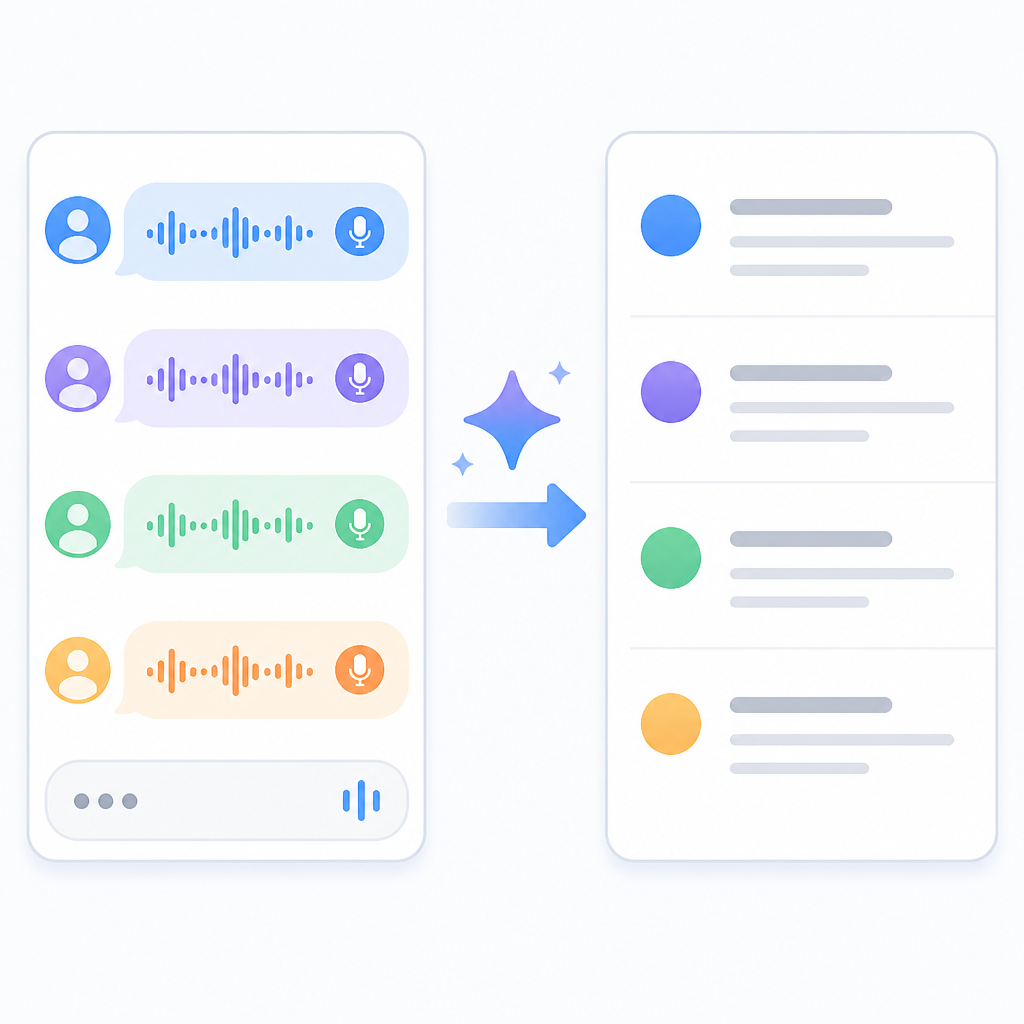
Go to Gemini Settings > Gemini’s voice for a redesigned voice picker. Instead of a carousel, you get a list.
What this actually means is that Google stopped making you swipe horizontally through voice choices like you were browsing album art. A list is boring, yes. It is also faster to scan, easier to compare, and much less likely to hide options off-screen. I’m not sentimental about carousels. They look slick in demos and get in the way in real life.
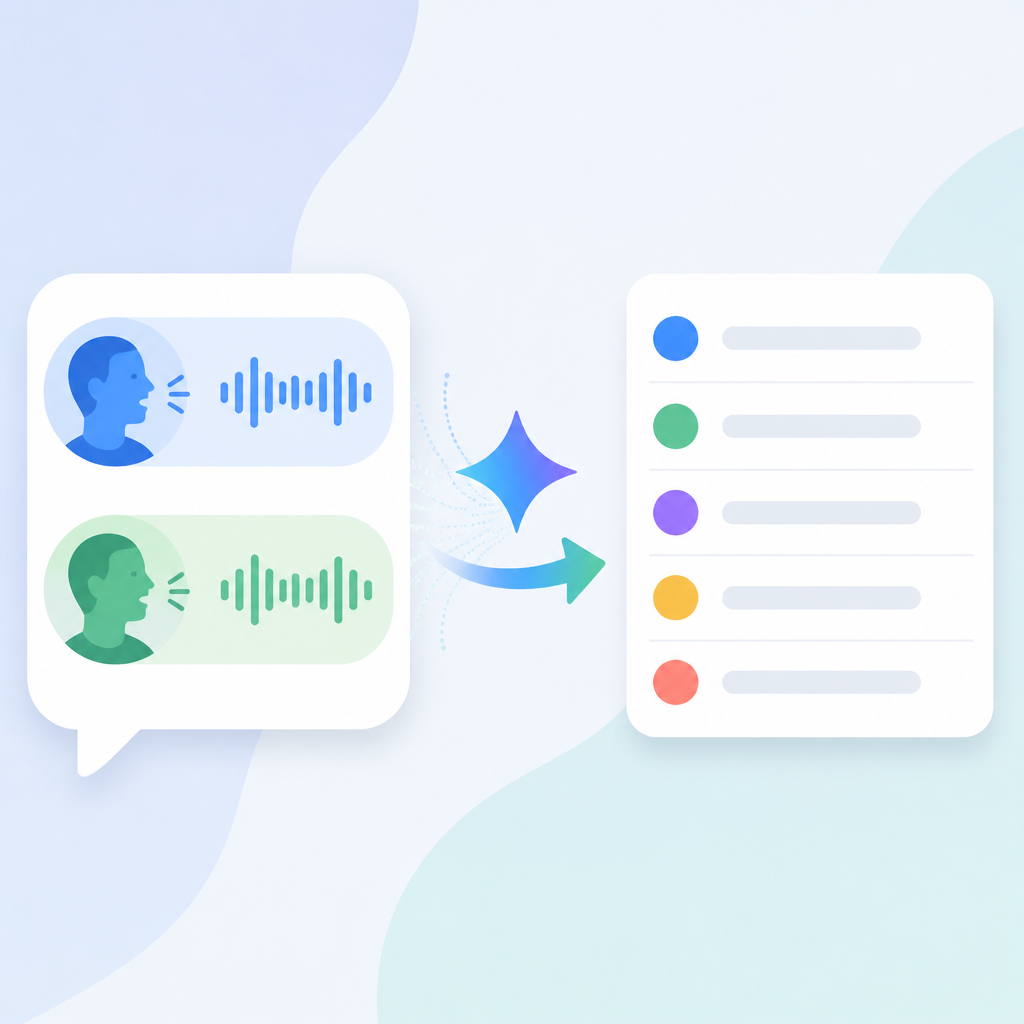
The redesign also removes the voice descriptions from the picker. That sounds like a loss until you notice the new structure: the voice names themselves are doing the heavy lifting, and the list format makes the names easier to read in one pass. The old setup tried to be friendly by labeling voices as Calm, Bright, Engaged, and so on. The new setup seems to trust the user a little more and the UI a lot more.
I’ve seen this exact failure mode in product work: a team thinks “more visual” means “more accessible,” then ends up with hidden options and extra taps. If you’re building a settings screen for anything users may want to compare, lists beat carousels almost every time. Especially when the choices are semantic, not visual.
How to apply it: if your app has mutually exclusive modes, styles, or presets, make them scannable first and pretty second. Put the comparison in the open. If you need previews, show them inline. Don’t bury them inside sideways scrolling unless you enjoy making people work for basic configuration.
- Use a list when the user needs to compare options.
- Use a carousel only when the visuals are the product.
- Keep the selected state obvious without extra taps.
The other thing I like here is that the redesign signals a product principle: voice is no longer a novelty bolted onto Gemini. It’s part of the core interface. That matters because once a setting moves from “cute option” to “primary behavior,” the UI has to stop acting like a demo reel.
Flare and Glow are doing the real work of renaming the experience
“Flare” and “Glow” are two new additions that replace Nova and Lyra.
What this actually means is that Google is refreshing the voice lineup without making the whole thing feel like a teardown. New names usually mean either a rebrand or a cleanup, and here it looks like a bit of both. Nova and Lyra are gone. Flare and Glow are in. The rest of the lineup still has that mix of personality and utility: Ursa, Vega, Pegasus, Dipper, Eclipse, Capella, Orbit, Orion.
That naming scheme is doing a lot of work. It gives the voices identity without forcing the user to decode technical descriptors. The old labels leaned on descriptive tags like “Calm” or “Bright.” Those are useful, but they also make the picker feel like a spec sheet. The new approach seems more like product branding with just enough personality to remember what you picked.
I’ve built enough settings panels to know that naming is never just naming. If the names are too generic, nobody remembers them. If they’re too clever, nobody understands them. Gemini’s voice names sit in that annoying middle zone where they are memorable enough to matter but not so whimsical that they become a joke. That’s a hard balance, and Google is at least trying.
How to apply it: if you’re naming presets, themes, assistant voices, or avatar styles, give them a stable identity and keep the list short enough to hold in working memory. Then pair the name with a sample, not a paragraph. Users should be able to test the option, not read a brochure about it.
- Replace descriptive labels with memorable names only if the names stay consistent.
- Keep the number of options manageable.
- Make the selected option obvious in both settings and runtime.
One practical lesson here is that voice systems need a taxonomy. If you don’t define one, users will invent their own and complain when the app doesn’t match their mental model. Google’s voice lineup is basically a taxonomy with personality, which is better than most teams manage.
Gemini Live and main chat should stop pretending they’re separate products
Following last week’s Neural Expressive redesign, the Gemini app is rolling out new voices for the main chat experience and Gemini Live.
What this actually means is that Google is aligning the spoken and typed sides of Gemini, even if it hasn’t fully unified them yet. That’s important because users don’t think in product silos. They think, “I’m talking to Gemini.” If the voice in Live feels different from the voice in normal chat, the whole assistant starts to feel stitched together from spare parts.
There was a comment under the 9to5Google post that caught my eye: “Can we now have the same voice between Gemini Live and Gemini?” That’s the right question. I don’t know whether Google will answer it, but the fact that someone asked it tells you the experience is currently fragmented enough to notice.
I ran into this in another assistant project years ago. The text mode felt precise and a little dry. The voice mode felt warm and chatty. The users didn’t call it personality. They called it inconsistency. That’s the trap. If the assistant has different tonal behavior across surfaces, people stop trusting the brand and start treating each mode like a different app.
How to apply it: if you ship both text and voice, define one voice identity and map it across every surface. That doesn’t mean every response has to sound identical. It means the emotional register, pacing, and vocabulary should feel like they came from the same system.
Also, if your app has a “Live” mode, don’t treat it like a separate toy. Make sure the settings, names, and feedback loops line up with the main product. Otherwise you’re just teaching users two interfaces for one job.
Neural Expressive icons are tiny, but they clean up the whole widget
Meanwhile, the widget layouts are unchanged from before, but all icons have been refreshed. Neural Expressive makes use of thin outlines for the Microphone, Camera, Gallery, File, Video, Screenshare, and Live.
What this actually means is that Google changed the visual weight of the widget without changing the widget’s structure. That’s a smart move. When the layout already works, don’t break it just to prove you were busy. Refresh the icon system, tighten the visual language, and leave the interaction model alone.
I’m biased here because I’ve shipped too many widgets that got “improved” by someone who wanted to rearrange everything. Most of the time, the user didn’t need a new layout. They needed the thing to look less noisy and be easier to parse at a glance. Thin outlines help with that. They reduce visual clutter and make the icons feel like part of a coherent system instead of a pile of unrelated glyphs.
The specific icons matter too: Microphone, Camera, Gallery, File, Video, Screenshare, Live. That’s a pretty standard action set for a multimodal assistant, which means consistency matters more than flair. If the widget is the surface where users jump into different input modes, the icons need to be instantly recognizable. No one wants a scavenger hunt before they start talking or uploading something.
How to apply it: if you maintain a launcher widget, shortcut grid, or quick-action panel, separate structure from style. Keep the action map stable. Update icon weight, spacing, and contrast to match the rest of the system. That gives you a visual refresh without forcing users to relearn the interface.
- Keep widget layouts stable when the actions already make sense.
- Use icon style updates to unify surfaces.
- Favor recognition over decorative detail in compact UI.
I also like that this update came through server-side with the latest Gemini app version, 1.0.913571982. That tells me Google is treating this as an iterative rollout, not a giant coordinated launch. Which is how most real UI improvements happen anyway: quietly, in pieces, after someone finally admits the old thing was clunky.
Server-side rollouts are how Google sneaks in product discipline
This is rolling out via a server-side update with the latest version (1.0.913571982) of the Gemini “app”/homescreen shortcut.
What this actually means is that Google can change the experience without asking users to do anything dramatic. No feature flag dashboard for the user, no “please update to continue” nonsense, just a gradual shift in what shows up. That’s useful when you’re refining surface-level behavior that doesn’t need a full app rewrite.
It also means the product team can measure whether the new voice picker and widget icons are actually better before they commit to them everywhere. I’m a fan of that kind of rollout because it keeps teams honest. If the change is good, it survives. If it’s annoying, it gets rolled back before everyone has to complain about it for six weeks.
There’s a practical lesson for anyone shipping AI features: don’t bundle the model change, the UI change, and the branding change into one giant release unless you enjoy debugging user confusion. Separate the layers. Let the interface evolve independently from the model behavior when you can. That way you know what fixed the problem, and what created the new one.
How to apply it: use server-side config for small but visible changes like picker layout, icon style, and default voice sets. Track the interaction cost. If users need less effort to choose, start, or switch modes, you’re on the right track. If support tickets spike because nobody can find the old option, you went too far.
The real story is that Gemini is getting less awkward to use
Following last week’s Neural Expressive redesign, the Gemini app is rolling out new voices for the main chat experience and Gemini Live.
What this actually means is simple: Google is sanding down the weird edges. The voice picker is more usable. The widget is cleaner. The voice set is more coherent. None of this screams for attention, and that’s exactly why it matters. Good product work often looks like a series of annoyances getting quietly removed.
I’ve learned to trust these small updates more than the loud ones. Loud launches tell you what a company wants to be seen doing. Quiet UI shifts tell you what the product team is tired of hearing about. In this case, I’d bet the complaints were about scannability, consistency, and visual clutter. Google seems to be answering all three without making a big speech about it.
How to apply it: if your AI product feels a little off, don’t start by inventing a new feature. Start by fixing the surfaces people touch every day. Settings, pickers, widgets, quick actions, and mode switches are where the friction lives. That’s also where trust gets built or lost.
The template you can copy
# Voice picker + widget refresh template

## Voice settings
- Use a list, not a carousel, for comparing voice options.
- Show one voice sample per row.
- Keep the selected voice visible without extra taps.
- Avoid long descriptive labels inside the picker.

### Example voice list
- Voice A — warm, mid-range
- Voice B — bright, higher pitch
- Voice C — deeper, steady
- Voice D — energetic, expressive

## Runtime behavior
- Keep the assistant's spoken voice consistent across chat and live modes.
- Match emotional tone, pacing, and vocabulary across surfaces.
- Let users change voice from one settings path.

## Widget layout
- Keep the action grid stable.
- Refresh icon style without changing the action map.
- Use thin outlines or a single icon weight across all shortcuts.
- Make the most common actions easiest to spot.

### Widget actions
- Microphone
- Camera
- Gallery
- File
- Video
- Screenshare
- Live

## Rollout plan
1. Ship the UI change behind a server-side flag.
2. Test the new picker with a small percentage of users.
3. Verify selection speed and error rate.
4. Roll out the icon refresh separately from the voice changes.
5. Keep the layout stable unless usage data says otherwise.

## Copy-ready product note
We replaced the voice carousel with a list so users can compare options faster.
We kept the widget layout the same and refreshed icon style for clarity.
We aligned voice naming across chat and live modes to reduce inconsistency.
That’s the part I’d actually copy into a product spec. The trick is not the exact names or icon style. It’s the structure: list for choice, stable layout for actions, and one voice identity across modes. That combination is what makes the whole thing feel less like a demo and more like a tool.
Source: 9to5Google’s report by Abner Li. My breakdown is original commentary and implementation guidance built from that article, not a reproduction of Google’s internal design docs.
For the underlying product surfaces, I also referenced the Gemini app, Google Play listing, and Google’s Gemini updates page as background links for readers who want to inspect the app and its broader rollout pattern.
// Related Articles
- [TOOLS]
Nvidia and LG turn AI plans into a playbook
- [TOOLS]
Ollama is the best free AI path in 2026 for real work
- [TOOLS]
This MLOps list turns chaos into a stack
- [TOOLS]
BentoML turns model serving into Python APIs
- [TOOLS]
Magenta RealTime 2 lets you score in the DAW
- [TOOLS]
Open-source AI tools beat Claude’s paid tiers on value